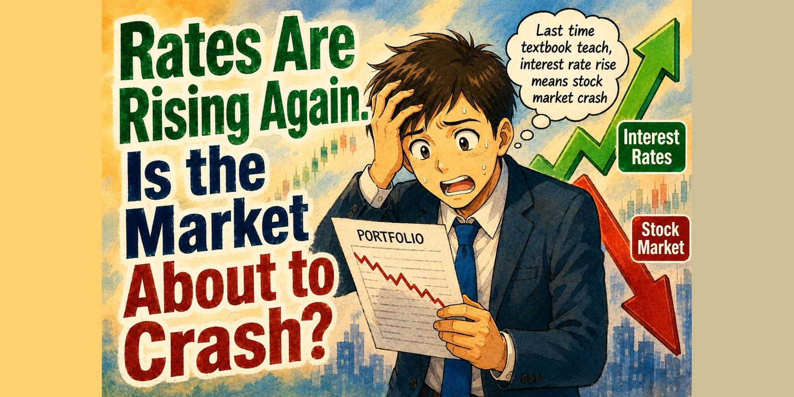
The 30-year US Treasury yield touched 5.31% on 17 August, a level last seen in 2007. The 10-year closed the week at 4.74%, a hundredth of a point from its high for the year. Shares sit within 2% of the record they set the week before — and the coverage has decided these two facts cannot coexist for long.
“The bond market is signaling trouble ahead for stocks,” ran one headline this month, and its sequels ask how big a stumbling block higher yields will prove. Three down sessions in a week get attributed to yields the way delays get attributed to weather. If you hold a portfolio that has done well, the question lands with some force: rates are rising — do I need to get out before they break something?
It is a reasonable question. It also has an unusually checkable answer, because rates have risen many times before, and somebody wrote down what happened next. We went and computed it. One promise before the numbers: nothing here forecasts the next twelve months. It prices the fear — and the fear, on the record, is overpriced.
The fear, stated properly
Before testing the worry, it deserves its strongest form, because it is not silly.
Higher yields hurt shares through two mechanisms. The first is arithmetic: a share is a claim on future profits, and when interest rates rise, profits that arrive years from now are worth less today. The second is competition: when a government bond pays 5.3% for doing nothing, the case for holding something that can fall 30% needs to clear a higher bar. “There is no alternative” was a real argument for a decade. At these yields, there is an alternative.
And the 2026 version has real texture. America’s deficit projection was just revised up to US$2.1 trillion. Three Federal Reserve policymakers dissented in July in favour of a rate hike — the first triple dissent in that direction since 2016 — under a new chair the market is still learning to read, a week before his first Jackson Hole speech. The supply of bonds is heavy, the buyers are demanding more yield, and none of that is invented.
Update, 17 September 2026: the hike came, unanimously. What the six previous first hikes did to US shares, gold and the STI is its own piece.
In plain English — the fear is not that rates rise a little. It is that this time the rise is driven by something structural, and that shares priced for perfection cannot absorb it.
That is the strongest version. Now the record.
What actually happened, all 819 times
The test is simple enough to state in one sentence. Take every month since April 1954 — the start of the Fed’s modern 10-year yield series — look back twelve months to see whether the yield rose or fell, then look forward twelve months at what US shares actually returned, dividends reinvested. That gives 819 usable months, ending with the June 2022 start, which is where our share series runs out of forward room.

median next 12 months +11.9% · positive 74 times in 100
median next 12 months +13.6% · positive 80 times in 100
Resampling the sample in three-year blocks, the two groups’ ranges overlap comfortably — the gap between them is inside the data’s own uncertainty. What is not in doubt is the level: both groups spent most of their time going up.
Whether the 10-year yield had risen or fallen over the past year told you almost nothing about the year ahead. The split that mattered was hiding in a different number.
Yield change measured over the trailing 12 months, FRED GS10 monthly averages. Forward return is the following 12 months, dividends reinvested, before inflation, Shiller US data (Yale). Overlapping windows. Our computation.
a theenoughpoint.com tool
Read that again, because it is the whole first half of the argument. Months that followed a rise in the 10-year yield — the thing the headlines treat as a warning shot — went on to deliver a median +11.9% over the following year, and a positive outcome 74 times in 100. Months that followed a fall did a little better. The gap between them is small enough that resampling the data in blocks swallows it whole.
The size of the rise did not rescue the fear either. Split the rising months by how far the yield had climbed, and even the two dozen months that followed a rise of more than two full points — the fastest in the sample — still saw shares rise two times in three over the next year.
History keeps specific examples if the aggregates feel bloodless. Between December 1962 and December 1968 the 10-year yield climbed from 3.9% to 6.0%, and US shares returned +105% with dividends reinvested — they doubled, through six years of rising rates. The same pattern is not confined to black-and-white footage. Across 2013, the taper-tantrum year, the yield jumped 1.2 points and shares returned +30%. From mid-2016 to late 2018 the yield doubled from 1.5% to 3.1%; shares returned +33%. And the very bull market the headlines now fear for was born inside the sharpest rise of all: between July 2020 and June 2023 the 10-year climbed more than three full points, and shares returned +42% over the same window.
In plain English — if rising rates mechanically broke share markets, the last seven decades could not have happened.
The six years it did go wrong
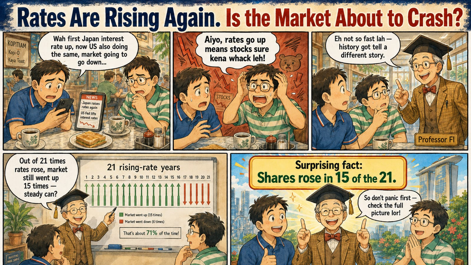
Now the concession, because it is large and it is the honest half of the piece. Rates and losses have shared a room before. Anyone who tells you rising yields never mattered is selling something.
Since 1954 there have been 21 calendar years in which the 10-year yield rose by half a point or more. Here are all of them — the size of the rise, what shares returned, and one more number the headlines rarely print beside them.
Shares rose in 15 of the 21. Every one of the six losing years carries the inflation dot — and no rising-rate year with inflation under 4% ended down. 1987 is the nearest miss: inflation 4.4%, the crash in October, and the year still closed a tenth of a point from flat.
Yield change is FRED GS10, December-average to December-average. Return is the calendar year’s S&P 500 total return on Shiller’s monthly-average basis, which smooths intra-month moves — 2022 prints −15% here against the −18% you will see on a close-to-close basis. CPI is December on December. Our computation.
a theenoughpoint.com toolSix losing years out of 21. Look at where they sit. 1969, 1974, 1977, 1981: the great inflation. 2022: inflation at 6.5%, the fastest hiking cycle in four decades, starting from a yield of 1.5% — an episode we would take seriously as the template for a repeat, if its ingredients were present. And 1987, the crash year, which for all its drama ended the calendar a tenth of a point from flat.
Every losing year carries inflation above 4%. And the reverse reads even better: since 1954, not one calendar year with rising yields and inflation under 4% has ended down. Eleven such years, eleven positive outcomes, 1994 scraping through at +0.5% as the nearest thing to an exception.
It was never the rates
That pattern is not a coincidence of six data points. Sort all 819 months both ways at once — by yield direction and by the inflation behind it — and measure what the next year returned after inflation, which is the only basis your future spending cares about.
under 4%
4% or higher
Moving the line to 3% or to 5% changes the sizes, not the shape: the cool cells stay near three-in-four, the hot cells stay near a coin flip. And the hot cells often still looked respectable before inflation — a median 13.8% nominal in the rising-yield one — which is exactly how purchasing power slips away without a headline.
Where is now? US inflation printed 3.4% for July 2026 — the left column, with the dividing line close enough to watch.
With inflation under 4%, the year after a yield rise beat inflation 74 times in 100. At 4% or above, it was 56 — and falling yields did not save you either, at 54. Read the column, not the row.
Trailing inflation is the prior 12 months of US CPI; real returns deflate the next 12 months of Shiller total return by the CPI over the same window. FRED GS10 for yields. Apr 1954 – Jun 2022 starts, overlapping windows. The July 2026 CPI reading is the US Bureau of Labor Statistics release of 12 Aug 2026. Our computation.
a theenoughpoint.com toolThe columns decide; the rows barely matter. With inflation under 4%, the year after a yield rise beat inflation 74 times in 100. With inflation at 4% or above, that fell to 56 — and here is the part the rate-watchers miss — falling yields in a hot-inflation regime did no better, at 54. The villain was never the yield. It was the inflation the yield was reacting to.
The sixties tell the whole story in one arc, which is why we put them on the cover. Rising rates did not stop shares doubling to 1968. Then inflation arrived in earnest, and from the end of 1965 to the end of 1981 shares returned +153% in nominal terms — a fine-looking brochure number — while losing 15% of their purchasing power. Nobody’s statement showed a loss. Everybody got poorer. That is what a hot-inflation regime does: it ruins you politely, in nominal gains that trail the cost of living.
The statement said $253; the supermarket said $85.50. The “safe” 10-year bond kept $63, and cash T-bills, rolled the whole way, $97.50 — standing still. In the one regime that truly hurt shares, the fear’s favourite shelter was the biggest casualty.
What $100 became, monthly, all after inflation except the gold line; shares reinvest dividends. The dashed line rolls a 10-year par Treasury each month at FRED’s GS10 yield, coupon accrued — an independent year-end construction (Damodaran’s annual series) compounds to about $60, same story. T-bills are Ken French’s one-month series. Shares and CPI from Shiller (Yale). December 1965 to December 1981. Endpoints re-derivable with the script in the fold below. Our computation.
a theenoughpoint.com toolNote where the worst damage landed. Not on the shares everyone fears for — on the bond the fear recommends. Cash held its ground only because short rates kept being reset higher, which is cash’s one trick. If a rising long yield ever tempts you to swap the top line for the dashed one, this is the chart to remember.
In plain English — the thing worth watching is not the 10-year yield. It is the inflation number underneath it. As of the July print, US inflation is 3.4% and cooling, which is the record’s benign column. The honest caveat is that 3.4% lives closer to the 4% line than anyone should be smug about; the useful habit is knowing which number would actually signal trouble, and it is a CPI release, not a yield chart.
One more cut, for what it is worth: the months that look most like now — a 10-year between 4% and 5% that had risen over the prior year — returned a median +9.4% over the following twelve months, positive 78 times in 100. We hold that stat loosely, because those 85 months cluster in just two eras (1959 to 1967 and 2003 to 2007). Directional comfort, not a forecast.
You do not have to pick a side
Perhaps the strangest fact in the August coverage: the professionals are not positioned for the disaster they discuss. The same survey that named a disorderly rise in yields a top tail risk found managers still favouring equities. Both thoughts are legitimate. So how do you hold both at once?
Not by forecasting the 10-year yield. The people who trade rates for a living misprice it routinely. You and we will not do better between school runs.
The older, humbler answer: decide in advance what evidence would change what you hold, and write it down. A rule can be as simple as a line on a chart, and “So what do you do” below gives two shapes it can take. What matters is that the rule does the reacting, so that you do not have to. Let evidence move you, or a pre-written rule — never a headline.
Because that is what the 819 months actually price. Yields grinding higher was survivable almost every time. The expensive thing was the unplanned exit. A rule set on a calm Saturday costs a page in a notebook; the same decision improvised in a 12% drawdown, with the coverage screaming, is where the real money has historically gone.
Singapore: the four doors this fear can enter
Everything above is US history, because that is where the long records live and where the bull market in question trades. But you are reading this in Singapore, and the same scare reaches a Singapore household through four different doors — and right now they are not all open.
Your global equities. The record above is this door’s insurance policy: even after the 10-year yield had risen, the next year’s median was +11.9%, and the losing years were picked by inflation, not by the yield. So the working watch-number for this sleeve is one monthly figure — US CPI against the 4% line, 3.4% at the July print — not the daily yield chart everyone else is refreshing.
Your S-REITs. The one local sleeve where the fear is not overpriced — but be precise about which rates matter, because two rate stories run through a REIT in opposite directions. The funding story is the friendly one: S-REIT borrowing is mostly priced locally, or in the currency of the buildings it owns, and Singapore’s rates sit low — so the cost of carrying the debt is easing, not biting. The pressure comes from the pricing story: a REIT’s distribution yield competes with long bonds for the same income buyers, and the global sell-off has pulled Singapore’s own long rates up with it — the Savings Bond’s ten-year average jumping from 2.06% to 2.25% in one month is that move, landing locally. The scoreboard says which story is winning: the STI is up about 22% this year; the listed S-REIT tracker is down roughly 8%. Hence the most honest sentence in this article: everything above about rising yields being survivable is a broad-equities finding, and it does not extend to this sleeve, whose pricing genuinely does track the long end.
Your mortgage — mostly shut. Here is the quiet good news the imported headlines obscure: Singapore’s short rates have not followed the US long end up. Three-month SORA compounds near 1.14% as of 20 August, and banks were advertising two-year fixed packages from roughly 1.35% to 1.5% this month. Your repricing risk keys off SORA, not off the US 30-year. An American household reads “rates are rising” and feels it in the mortgage; a Singaporean household, at the moment, largely does not.
Your safe layer — where the fear pays you. The flip side of low local short rates: the 6-month T-bill cut-off has drifted down to 1.56%, a third of what it paid at the 2023 peak. But the global long-end sell-off has quietly improved the other end of the safe menu: the September Savings Bond issue’s ten-year average return jumped to 2.25% from 2.06% in one month — the sell-off in bonds is, mechanically, an improvement in the deal offered to whoever holds safe money for longer. That is not a recommendation of any product. It is the same force the headlines fear, seen from the other side of the ledger.
In plain English — before adopting an American fear, check which doors you actually own. A reader with a SORA mortgage, a CPF balance and a world index fund is living a very different rate story from the one on CNBC.
Tick any that apply, and this month’s rate story is re-read from your side of it.
The whole history above is about this sleeve. On the record, the yield direction alone told you very little — the number that separated good years from bad was US inflation, printed monthly, now 3.4% against the 4% dividing line.
Rate-sensitive through its pricing, not its borrowing: S-REIT funding costs are mostly local and easing, but the yields their distributions compete with are set by the long end — and that is what the market has priced, with the listed S-REIT tracker down roughly 8% this year against a +22% STI.
Priced off SORA, not off US yields — 3-month compounded SORA sat near 1.14% in late August 2026, with two-year fixed packages advertised from about 1.35%. The imported headline does not reprice this door at the moment.
The short end has drifted down — the 6-month T-bill cut-off is 1.56% — while the same global sell-off lifted the September Savings Bond’s ten-year average to 2.25% from 2.06%. The force the headlines fear pays this door more for going longer.
A map, not advice: which doors you hold is yours to weigh, and the figures carry the as-at dates given in the text above — they will drift. The live numbers are a click away whenever you read this: SORA, the latest T-bill and Savings Bond issues, the S-REIT tracker and the US 10-year yield.
So what do you do
The cheap, boring fixes, in the order we would think about them.
Write the rule down while it is still a calm Saturday. A written rule has a shape: if my equity share drifts more than ten points past its target, I rebalance back — or, for those who want an exit rule, if the index ends a month below its ten-month average, I cut to a weight I could hold through anything. Both are illustrations, not recommendations; the content matters less than the timestamp. A rule written now is a decision made by you. The same decision improvised during a 12% drawdown is usually made by the headlines.
Swap the yield chart for one calendar entry. The record says the column decides, and the column is set by a number published once a month on a fixed schedule — the US CPI release, one evening a month Singapore time. Put the release dates in your calendar and let the daily bond coverage go. If 3.4% starts walking towards 4%, you will know within hours of everyone else; if it does not, you were never in the bad cell to begin with.
Then ask the only question that is actually yours. A plan built for a working life already assumes several bear markets it cannot time. If a 5.3% thirty-year Treasury genuinely threatens your plan, the problem predates this month’s yields. The market will settle its argument with the bond market without consulting either of us — the enough point was always about how much of that argument you need to win. How much is it, for you?
Check it yourself — the rule we ran, the figures you should get, and our script
We would rather you did not take our word for it. The rule takes an afternoon to re-implement, both datasets are free, and the figures you should get are printed below.
The rule, stated exactly
- Take every month from April 1954 that has a full year of data behind it and a full year of share returns ahead of it — 819 of them, through June 2022.
- Behind it, measure two things: did the 10-year Treasury yield rise or fall over the trailing 12 months (FRED’s monthly averages), and what was CPI inflation over those same 12 months?
- Ahead of it, measure the next 12 months of US share total return, dividends reinvested — once as printed, once after inflation.
- Sort the months by what was behind them, and compare what came next.
Use total return, not the bare index. Dividends were a third of the sixties’ story, and leaving them out is how the same history gets retold as a disaster.
What you should get
| Sorted by | Months | Median next 12m | Positive |
|---|---|---|---|
| Yield higher than a year earlier | 434 | +11.9% | 73.7% |
| Yield lower than a year earlier | 381 | +13.6% | 80.3% |
| Rising yields, inflation under 4% (real) | 263 | +8.7% | 74.5% |
| Rising yields, inflation 4%+ (real) | 171 | +4.4% | 56.1% |
First two rows are nominal; the inflation rows are real. Calendar-year check: the 10-year rose at least half a point Dec–Dec in 21 years; the S&P 500’s total return was positive in 15, and the losers were 1969, 1974, 1977, 1981, 1987 and 2022. Small differences are expected if you handle months with no dividend figure differently from us.
Or run ours
Download the script — one file of Python, written to be read. It fetches both datasets itself, recomputes every figure above plus the episodes and the 2×2, and prints OK or MISMATCH against what we published. If you get a mismatch, we would genuinely like to hear about it.
pip install pandas numpy requests xlrd
python rising-rates.py
The data
- Shiller, US prices, dividends and CPI from 1871 (Yale) — the
Datasheet - FRED series GS10 (St. Louis Fed) — monthly-average 10-year constant maturity yield from April 1953
Where our numbers are soft — where we would push back on ourselves
Everything above the Singapore section is our computation, so here is where we would push back on it hardest.
- Overlapping windows flatter the sample size. Adjacent months share eleven-twelfths of their forward year, so 819 months is far fewer independent observations than it looks. Resampling in 36-month blocks, the rising-months positive share ranges roughly 67 to 83 in 100 — which is why we lean on the rising-versus-falling gap not existing, rather than on any precise figure. The inflation split is wider than the noise, but carries the same caveat.
- The 4% inflation line is our choice. Moving it to 3% or 5% changes the cell sizes, not the shape: cool cells stay near three-in-four, hot cells stay near a coin flip. Still, the roundness of “4%” is ours, chosen after looking.
- Our return basis smooths the drama. Shiller’s monthly series averages each month’s prices, so calendar figures differ from the close-to-close numbers you will see elsewhere — 2022 prints −15% here against the −18% you remember, and intramonth crashes look gentler than they felt. One basis, used consistently, disclosed here.
- The sample ends with June 2022 starts, because Shiller’s dividend series stops in mid-2023. The 2024 to 2026 experience — including the very sell-off prompting this piece — is not in the tables. It is, unavoidably, the out-of-sample test.
- The “months most like now” cut is two eras wearing 85 months. We flagged it in the text and repeat it here: it is colour, not evidence.
- Yields are monthly averages (FRED GS10), so quoted daily extremes — the 5.31% of 17 August — will not match the series the computation runs on.
- The bond line is a construction. No investable 10-year index fund existed in 1966; the dashed line rolls a par 10-year Treasury each month at FRED’s GS10 yield, coupon accrued. Damodaran’s independent year-end construction compounds to about $60 of purchasing power against our $63 — the method moves the endpoint by a few dollars, never the story. The T-bill leg matches Ken French’s published series to 0.4%.
- All of it is US history. Long, clean, free — and one country. We have not computed the Singapore equity equivalent, because the long STI series carries a dividend assumption we have previously flagged as too soft to lean on.
Sources — where every figure comes from, all free and public
Every source below is free and public, so you can check any figure yourself.
- US share history — Robert Shiller’s dataset (Yale), monthly prices, dividends and CPI from 1871, used to construct total returns.
- US 10-year yield — FRED series GS10 (St. Louis Fed), monthly averages from April 1953; current daily levels from the US Treasury’s daily yield curve, readings as of 21 August 2026.
- US inflation now — CPI report for July 2026 (CNBC on the BLS release of 12 August 2026): headline 3.4%, core 2.5%.
- The 2026 backdrop — CBO’s revised US$2.1tn deficit projection (Fortune, 10 August 2026); the July FOMC decision with three hawkish dissents (CNBC, 29 July 2026); the fund-manager survey via Bloomberg, 20 August 2026.
- The video that prompted this piece — Chris Ciovacco, “Rising Rates: Bad For Stocks? Not So Fast” (CiovaccoCapital on YouTube, 21 August 2026). The sixties episode he cites checks out against the primary data above — his 6.2% is the daily year-end 1968 print where our 6.0% is the December monthly average. His own market analysis is his; we have not re-run it.
- The ten-month-average rule — Meb Faber, “A Quantitative Approach to Tactical Asset Allocation” (SSRN), the published version of the trend rule described — mechanism reported, not recommended.
- Singapore figures — 6-month T-bill cut-off 1.56%, 13 August 2026 auction (Beansprout, on MAS data); September 2026 Savings Bond first-year 1.52% and ten-year average 2.25%, MAS issuance data via TheFinance.sg (5 August 2026); 3-month compounded SORA 1.1368% as at 20 August 2026, MAS data via Cashew.sg; advertised two-year fixed mortgage rates from about 1.35%, August 2026 listings on comparison sites — ballpark, not quoted offers; STI +22% and the S-REIT tracker −8% year to date computed from exchange closing data to 21 August 2026, the REIT figure via the listed iEdge S-REIT Leaders tracker as a proxy because the index’s own print is not freely published.
All forward-return, calendar-year, episode and 2×2 figures are ours, re-derivable with the script above.
Past performance is no guarantee of future returns. This is general information about how markets have behaved, not advice about your circumstances — and nothing here recommends buying or selling anything.